


BASIC DESIGN CONSIDERATIONS
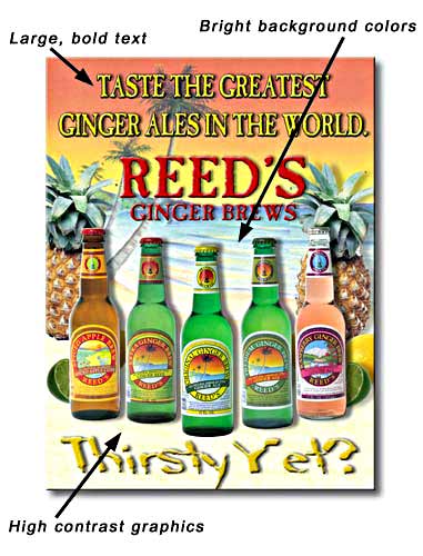 Small detail and type are not suitable for films with a 50/50 perforation pattern because 50% of the film is missing due to the perforation process. Window films with a 70/30 or 65/35 perf pattern are recommended for graphics-intensive designs.
When including text in the design, use a font size of 30 or larger for 70/30 or 65/35 films, and 50 or larger for 60/40 or 50/50 films.
Bright colors provide the best results. Avoid using dark colors for backgrounds or other large areas. This is because with bright colors the eye tends to focus on the graphics, whereas dark colors allow the eye to see through the graphics, which in most cases is the opposite effect than desired.
PLEASE NOTE...
Note: The perforating process reduces the reflectivity of an image. We suggest increasing the image contrast by 10%-20% to compensate for this effect.
 |
 |
 |